Creating the Featured Item
Let’s continue with our site by making our next component - The Featured Item!
It’s going to be similar to a typical Hero section, which is the first thing users see on a webpage. It usually displays a popular or important item to make an immediate impression.
Overview
This guide builds on your previous skills by:
- Practicing layout and flexbox with Tailwind CSS to position text and images.
- Using backgrounds, borders, and spacing to style elements.
- Handling images to make sure they fit without losing quality.
- To download the folder of images that we will be using for this project, go here.
- Create a new folder in
root\publiccalled\images. Download the file and save the contents into this folder. Or drag the entire folder into\publicif you prefer.
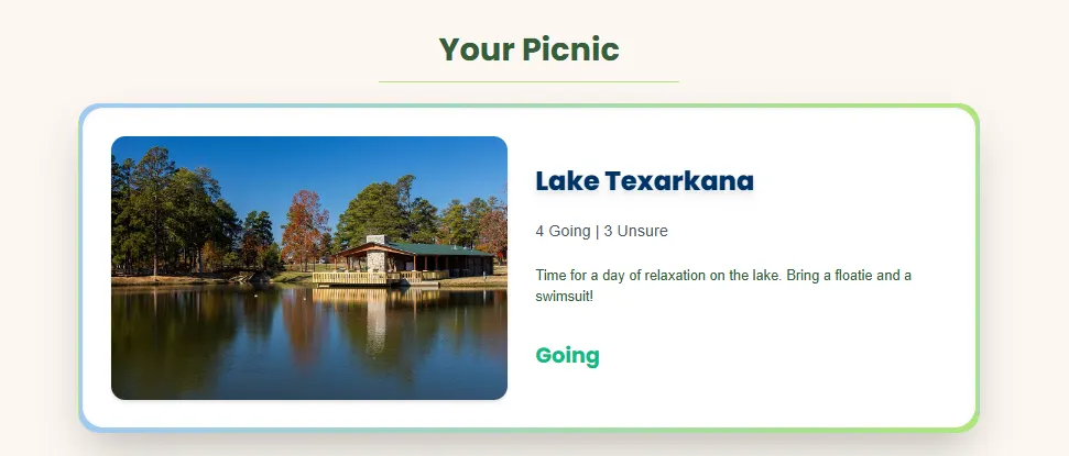
Here’s what our section will look like at the end.
Challenge 1: How do you set up a component?
Can you remember how we created a component from the previous lesson? What about importing it?
- Create a New Component: Hint: Which folder does this belong in?
- Add the Structure: Write a function
FeaturedItemthat returns a<div>and export it at the end. Hint: Use the shortcut ‘rfce’
Answer - Import the Component: This can be done in the same way we imported the Navbar Answer
Challenge 2: Can you replicate this skeleton structure?
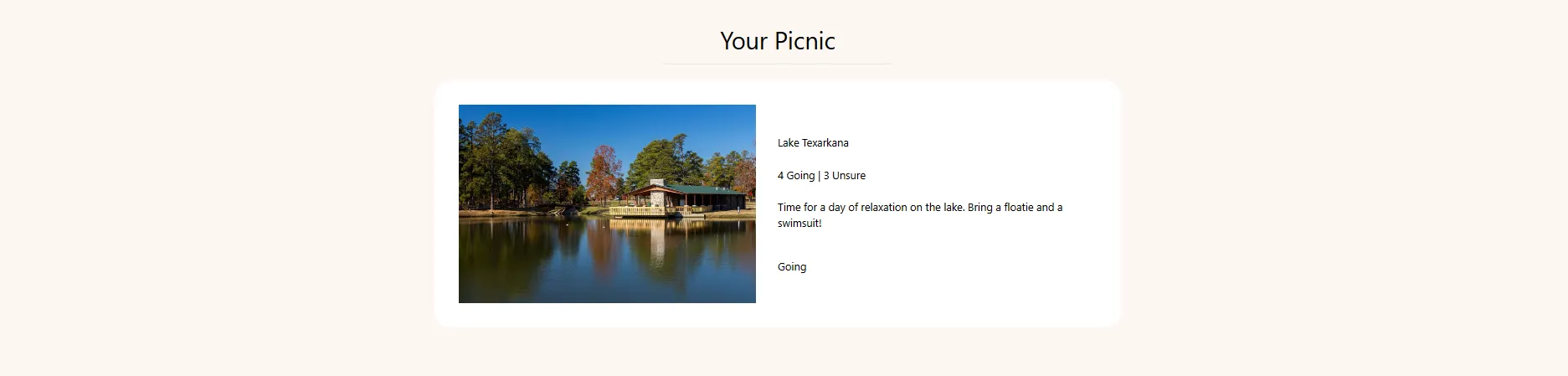
- Inside
FeaturedItem.jsx, delete the ‘FeaturedItem’ text within the div and you should be left with an empty div. - Let’s dissect the image before we get into the answer:
- First, notice how all of the content is centered. We also have a margin at the top that spaces the words away from the Navbar.
- Below that, we have a small line that separates the box from the text. It takes up about a third of the page horizontally.
- And then we have our main box. It contains two elements, an image and another box with text. The box on the right has an even Y axis spacing of the texts.
Tips:
- We have many more
<div>elements than meets the eye. - For the image, you can use the same one we downloaded earlier or find one of your own. Make sure that it’s high quality and has a good aspect ratio. In the attributes of your
<img>HTML element, there’s ansrc=''attribute that specifies the relative path to the file from the public folder. Therefore the file path should besrc="/images/Texarkana.jpg"because the\imagesfolder resides in the\publicfolder. - As for the separate texts, they should all be contained inside a single
<div>with even vertical spacing except for the last “Going” element, which has additional padding at the top.
Answer
Note that the answers from hence forth will start to get a little more complicated. If you’re ever lost, please do not hesitate to reach out either at our Help Desk located in the Atrium or on discord
Challenge 3: How should we style our component?
Take a closer look at our final product. In comparison to our skeleton, what differences do you notice that we have to implement? Let’s go through them step by step
-
Starting with the background/box. We need to add this gradient border that goes from blue to green. How can we do that?
Answer: Adjust the styling for the main BOX element. Replace
bg-whitewithbg-gradient-to-r from-pastelblue to-pastelgreen. Let’s also addshadow-2xl.
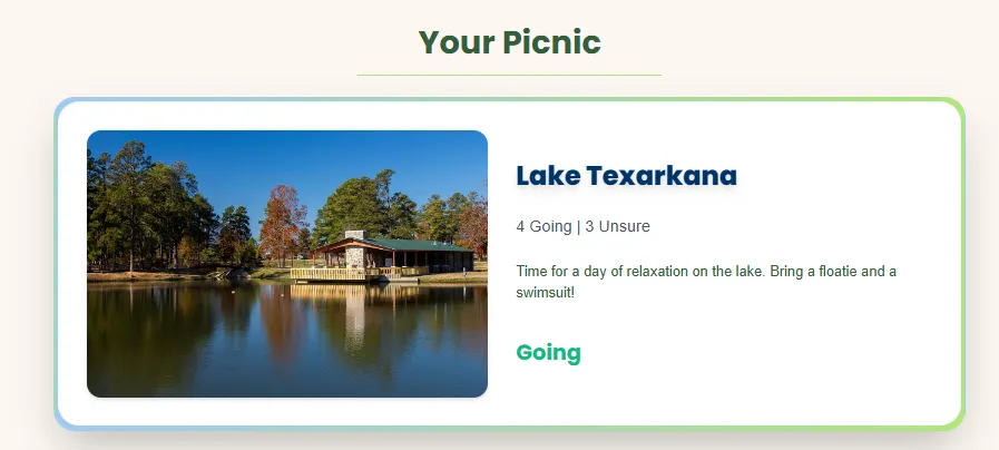
Your page should look like this. -
Our title should be dark green, bold, and the horizontal line should also be green.
Answer: For this, we need to add
poppins-bold text-darkgreento our Title element. And for the<hr>element, we need to addborder-pastelgreen -
But what about that white background? This is where that somewhat random
<div>that we created earlier is going to come in.Answer: Find the inner
<div>with its only styling beingp-8. Let’s add the following stylizations:rounded-3xl bg-white shadow-inner transition duration-500 hover:scale-105 hover:shadow-2xl
At this point, your code should look like this. -
Now let’s move on to the actual content of our box, starting with the Image on the left. One thing that you might’ve noticed is that our image should be rounded and have a shadow.
Answer: To make this change, let’s add an attribute of
rounded-2xlandshadow-md. Let’s also make another hover effect for additional interactivity. This effect will rotate our image and make it bigger. We can do this through these styles:transition-transform duration-500 hover:rotate-3 hover:scale-110. -
For our last step, let’s style the text.
- “Lake Texarkana” bold, large, dark blue, and has a shadow.
- The ‘4 Going | 3 Unsure’ should be bigger, have a gray color, and uses the inter-regular font
- The description of the event should have dark green color, and uses the inter-regular font
- And lastly, our “Going” should be styled as emerald-500 color, large, and bold.
The final code for this page can be found here.
Congratulations!😊
This section may have been difficult to approach but we are so proud of you for making it to the end. To summarize what we did in this section, our goal was to practice styling and mimicing the final product to the best of our ability.
It’s perfectly okay if your code wasn’t the same. Take a small break and come back to this project when you’re ready. In this next section we’re going to be learning some more React.