Making Reusable Cards in React with Custom Data
In this guide, we’ll make reusable, customizable Card components using React and props. Props allow you to pass specific data to each component so that each card can display unique information without rewriting the component itself.
Why Are Reusable Components Important?
Reusable components save time and keep your code organized. Think of a list of products in a store or blog posts on a news site. You don’t want to write a new component for each item—props allow you to use one component for all items, customizing each one with its own data.
What You’ll Learn
Challenge 1: What are props?
Now that we have a basic card structure, let’s make it customizable by introducing props. In React, props (short for “properties”) are a way to pass data into a component to make it more flexible. You can read more about props here.
- Add Props to the Function Header: Update the function header by adding
propsas a parameter. This tells React that the component will receive some data from outside.
// Card.jsx
import React from "react";
function Card(props) {
  return (
    ...
  );
}
export default Card;
Challenge 2: How do we use props?
Now that props is set up, let’s replace the hard coded content with data from props. This will make it so each card can display unique information passed in from outside.
- Replace the static content with
propsvariables. Wherever there was hard coded text or an image URL, replace it withprops.variableName, like{props.name},{props.img}, etc.
Solution Code
// Card.jsx
<div className="h-full w-full rounded-2xl bg-white p-4 transition duration-300 hover:scale-105">
  <img
    className="mx-auto my-4 h-40 w-full rounded-xl object-cover shadow-md"
    src={props.img}
    alt=""
  />
  <div className="space-y-3">
    <h1 className="poppins-semibold text-xl text-darkblue">{props.name}</h1>
    <p className="inter-regular flex py-1 text-sm text-gray-500">
      Bringing: {props.bringing}
    </p>
    <p className="inter-semibold text-sm text-emerald-500">{props.status}</p>
  </div>
</div>;
Explanation
Using {props.img}, {props.name}, {props.bringing}, and {props.status} lets us customize the card with different information each time we use it. This approach makes the component reusable with unique data each time, which is particularly useful for displaying lists of similar items like products, profiles, or posts.
In this next step, we’ll create a dashboard component that will render the <Card /> component.
Challenge 3: What is the dashboard?
We’ll use a new component called Dashboard.jsx to send information to the <Card /> component.
What’s the purpose of this dashboard? It’s going to act as a container for our cards and display them in a grid, and also handle the information processing.
- Create a new
Dashboard.jsxcomponent and render it in ourapp.jsxfile. We can take out the<Card />fromapp.jsxbecause we are going to be rendering card in the dashboard now. - Copy this boiler plate code for the
Dashboard.jsxcomponent. We will be focusing on the functionality in this section.
Challenge 4: How do we pass in data to our Card with our Dashboard?
How do we pass in information into our card component? How does it know what to use?
-
Start by rendering a
<Card />component within ourDashboard.jsxfile in the ‘Event List Grid<div>' -
What four properties does our card component expect to utilize? It’s these four:
- img
- name
- bringing
- status
{/* Event List Grid */}
<div className="relative z-10 grid sm:grid-cols-1 md:grid-cols-2 lg:grid-cols-3 gap-6">
  {/* Map through items and render a Card component for each in the section below */}
  <Card />
</div>; -
Let’s pass in the correct information for the four attributes by declaring those variable names with its respective value. We do this by creating the attribute name and assigning the value within the Component parameters.
{/* Event List Grid */}
  <div className="relative z-10 grid sm:grid-cols-1 md:grid-cols-2 lg:grid-cols-3 gap-6">
    {/* Map through items and render a Card component for each in the section below */}
    <Card
    img='/images/sample1.webp'
    name='Alan Roybal'
    bringing='Fruit'
    status='Going'
    />
  </div>
- At this point, you should be able to see the same Card display that we saw earlier when we hardcoded the information within the
<Card />component. Note that we are still hardcoding it right now, but just passing in the information instead.
Main Takeaway
We changed our Card component to expect an object called props within its function parameters. We then destructured the props object with the dot ‘.’ operator into separate attributes such as props.img and props.name. We then rendered a new <Card /> component within our Dashboard.jsx file that specified the value of these attributes. Essentially we passed in an image, name, bringing, and status value for our Card component to utilize.
Challenge 5: How can we use .json files within our Dashboard component?
In this challenge, we are going to understand how the data.json file works.
- Let’s add our
data.jsonfile into our directory. In\root\src\create a new folder called\data. It should be at the same level as the\componentsfolder. You can either copy and paste this code and paste it into a file calleddata.jsonwithin the\datafolder or download this file and add it to your\datafolder. - Let’s understand the structure of the
data.jsonfile: This JSON file contains an array of objects. Each object represents an individual entry with several properties. In our file, we have the following fields/keys: - id - an int that is the unique identifier for each object
- name - a string of the name of the person
- img - a relative path to the image based on our
\public\imagefolder - bringing - a string he item that a person is bring
- status - a string of their event status
- Each object in the array represents a card’s data, so you can imagine that each entry will be used to populate a unique and separate Card component. You can modify this file to your liking to change the idea of your project.
Challenge 6: How can we leverage the Browser Development Tool?
How can you display the information contained in our data.json file? How can we access the Browser Development Tool (i.e. Inspect Element)? You can access the tool by right clicking on your browser and pressing Inspect Element. You can also press ‘ctrl + shift + i’ or f12
In our previous challenge, we added the data.json file into our directory.
Let’s import our data into our Dashboard so that we can use it.
Just like we would import any React component, we can import our data.json in the same fashion with a single line of code: import data from '../data/data.json'
How would we display how this data is formatted within our component?
- Add a
console.log(data);statement in the first line of ourfunction Dashboard()- The body of our function expects Javascript, whereas our
Return ()statement expects HTML, so our console statement needs to be outside of ourReturn ()statement.
This should be your code at this point.
- The body of our function expects Javascript, whereas our
- Open your browser’s developer tools (usually F12 or right-click > Inspect) and go to the Console tab.
It should look something like this:
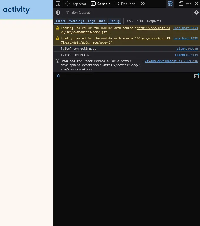
- Refresh the page and you should be able to see the console.log(data) output in the console.
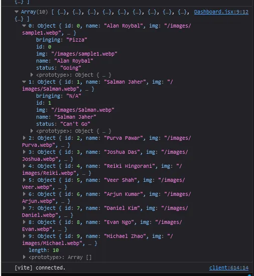
- But what does this information mean? We can see how each object has a set of its own attributes. We are going to be using this information in our next step.
Explanation
Using console.log(props); in the console lets you see the data being passed to the component. It is an essential skill to understand the developer tools of your browser and console.log is just one of the ways to utilize it.
Challenge 7: How can we loop through all of our data?
Not only do we have to loop through all of our data, we need to create a separate Card component for each index of our data. Is there an effective way to accomplish this? Look through this documentation and see if you can figure out which method we need to use.
Hopefully after reading through that page you’ve figured out that we need the map function!
- First let’s ask ourselves, what are we mapping through?
It’s the
data.jsonfile we imported earlier. We gave it the namedataso that is how we will refer to it from hence forth. - Now to map through this file, our code should have this structure. Note that this code is incomplete as of now.
data.map( (object) => <Card />)
- If we leave the code as it currently is, our output should look like this. And this is exactly what we want right now. For every object in our list, we are rendering an individual Card component. Our next step is to destructure our object into its separate attributes and pass it into our Card.
- What attributes do we need to pass in again? Hint: Check the Card component
- Answer:
img,name,bringing, andstatus!
- Answer:
- What attributes do we need to pass in again? Hint: Check the Card component
- Below is the code for our map function:
{/* Event List Grid */}
<div className="relative z-10 grid sm:grid-cols-1 md:grid-cols-2 lg:grid-cols-3 gap-6">
  {/* Map through items and render a Card component for each */}
  {data.map((object) => (
    <Card
      key={object.id}
      name={object.name}
      img={object.img}
      status={object.status}
      bringing={object.bringing}
    />
  ))}
</div>;
- Let’s briefly explain what’s going on within our Card component.
- If you look back at our
data.jsonfile, we have the a set of keys and values for every object such as"id: 0, "name": "Alan Roybal",. When we destructure each object, we need to use the same key name for each attribute, i.e.object.id,object.name, etc. - As for the left hand side
key=,name=, etc. these are the prop variables that the<Card />component expects to have. So these variables must match the props.variable names that we declared in the Card component.
- If you look back at our
- Here’s the final code for this section.
Main Takeaway
Map Through the Data: Use map to iterate over each object in the data array, creating a new <Card /> component instance for each.
Destructure the Object: Break down each data object into its key-value pairs, passing only the needed values like img, name, bringing, and status as props to <Card />.
Summary
By passing data through props, you’ve learned how to:
- Debug and inspect props in the console to better understand how data is managed in React.
- Customize and reuse components by passing data into them rather than hardcoding content.
Congratulations!⭐
You’re almost done! We have just one more page left for front-end, and it’s arguably the easiest one! Give yourself a big pat on the back for a job well done and take a nice long break because you deserve it!